Easily view, track and present performance
Tracking and presenting performance can be a challenge. Usually there are too many numbers which makes it hard to see the big picture, or it is ignored until quarterly reviews. The performance tracker template solves all of these issues, and can be linked to daily, weekly or yearly data with ease.
Updated Jan 2021
Steps
1. Enter inputs to table
2. Change measurement value (currency, hours etc)
3. Done
Creation Process
1. The Objective
We had meetings with a hideous template that listed all the weekly numbers, including actuals, budgets, forecasts... to name only a few. Not only was this sheet difficult to read and focus on the right areas, it promoted discussion about the past and we were purely thinking about historical data. This meant the discussions went like "Why are you under, what did you do wrong that week?".
What we needed was a sheet to push forward thinking, that was easy to read and present. "This site's production is here, but it should be there..." (extent of the historic thinking, and done within 10 seconds) "...what are we going to catch up before the years end?"
So I decided to put together a sheet displaying cumulative actuals and budgets.
2. Research (the hard part)
Initially I had the idea of creating a speedo/pie-chart, where the pie was the budget and the filling the actuals. After more thought, I came to the conclusion a column chart that filled up would be better. What happens if a site finished the year above budget - it would be hard to display that within a pie. Also bcolumn charts are easier to compare, especially if each site has different budgets - a taller column is easier to read than a bigger pie.
I had a quick look online for some ideas, and I came across this image which was the basic template I wanted to build.

The rest was just trial and error.
3. Building The Sheet
There are two types of templates for this chart - one is purely visual:

And the other is full of data:

I read once that before you start any project, decide whether or not you want to show numbers, or just visual elements. Mixing the two makes everything more confusing - as people don't know whether to focus on the visual picture or specific numbers.
I agree with this thought, however I will detail how to make the template with all the numbers and then it is very easy to delete them. All the of numbers were requested by the management team I was presenting this to.
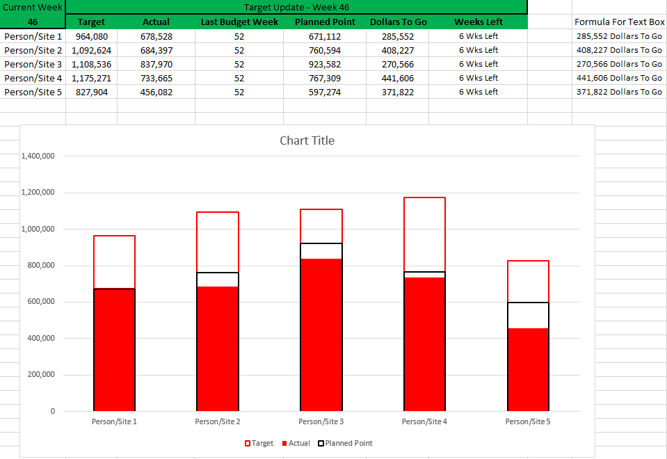
1. Create your data input box. This chart is based on weekly data, so I use a lookup on the week number in A2 to pull the data from various other spreadsheets. However manually inputting the data will work just as well.

Some of these you might not need, however I advise you put them all in and delete as appropriate after you have the completed template.
Here are all the formulas you need.
A2- =ISOWEEKNUM(TODAY())
B1- ="Target Update - Week "&A2
G3- =D3-($A$2)&" Wks Left" (drag down)
I3- =TEXT(F3,"#,#")&$F$2 (drag down)
2. Select A3:C7 and insert a "clustered column" chart.
Click on the "Design" tab, then on "Select Data". Click on "Series1", push edit, and for "Series name" click on the select range button and select B2, click ok. Repeat for "Series2", but click on C2.
3. Click on "Select Data" again. Click on "Add". Select cell E2 for "Series name" and select range E3:E7 for "Series values".

We now have our data in the chart, all that is left is formatting by merging the columns into one.
4. Right click anywhere on the chart, and select "Format Chart Area" (2nd from the bottom, name may vary depending on that you clicked on).
A column will open up the the right, on the top left of that there is "Chart Options", click on the arrow and select "Series Target". Just below that, click on the three column icon.
Set "Series Overlap" to be 100% and "Gap Width" to be 150%.

5. Make sure you are still on "Series Target" and select the paint can icon.
Change "Fill" from "Automatic" to "No Fill".
Change "Border" from "Automatic" to "Solid Line". Set the border colour to Red, and width to 1.75.
6. Under "Series Options" Select "Series Actual".
Change "Fill" from "Automatic" to "Sold Fill". Select fill colour to Red.
Change "Border" from "Automatic" to "No Line".
7. Under "Series Options" Select "Series Planned Point".
Change "Fill" from "Automatic" to "No Fill".
Change "Border" from "Automatic" to "Solid Line". Set the border colour to Black, and width to 1.5.
You now have the main performance tracker template! All that is left is to add data labels if you desire.
8. Click on the chart, a little plus icon will appear to the left of it. Click on it, and tick "Data Labels".
Click once on the data labels up the top (the budget labels). They will all be selected, hit "ctrl B" to bold them.
Click once on the data labels closest the bottom (the actual labels). They will all be selected, right click on them, "format data labels". Click on the 3 column picture, and under "label position" click on "center". Click on the paint bucket. Change "fill" from "no fill" to "solid fill", and change the colour to white. This is so you can easily print it out in black and white.
Click once on the data labels in the middle (the planned point labels). They will all be selected, right click on them and select "change data label shapes". Select the "left arrow callout" (hover over the icons to see their name).
The tedious bit now, is that you have to drag the callouts so they are off to the left of the columns and pointing to the black line.

9. Finally just the text boxes remain, click on the chart. Click on the "Insert" tab, "Text Box" and draw a small box below "Person/Site 1" in the chart. It's important you select the chart before doing this, so the text box moves along with the chart.
Click on your text box, click in the formula bar (above the column numbers). Make sure your typing indicator is visible in the formula bar. Type = and click on cell G3. Hit enter. Your text box is now tied to the chart and cell G3.
10. Repeat step 9 for all columns and for the contents in column I.
11. Click in the chart header box. Click in the formula bar, type = and click on cell B2.
You now should have a chart similar to the one below!

4. Summary
I use the template a lot - not only for presentations but for my own personal dashboards. It makes it so easy to monitor performance, I can tell in a second where we are at. It is also incredibly easy to modifier - the most difficult part of the creation process is lining up callouts and text boxes.
Why not now learn how to add this graph to a PDF, that is emailed automatically? Read about it here in my PDF Email Tutorial.
Also check out my Auto Resize Charts macro, to make your reports perfect.
5. Download
More templates

