Linear Forecast with Excel Graph
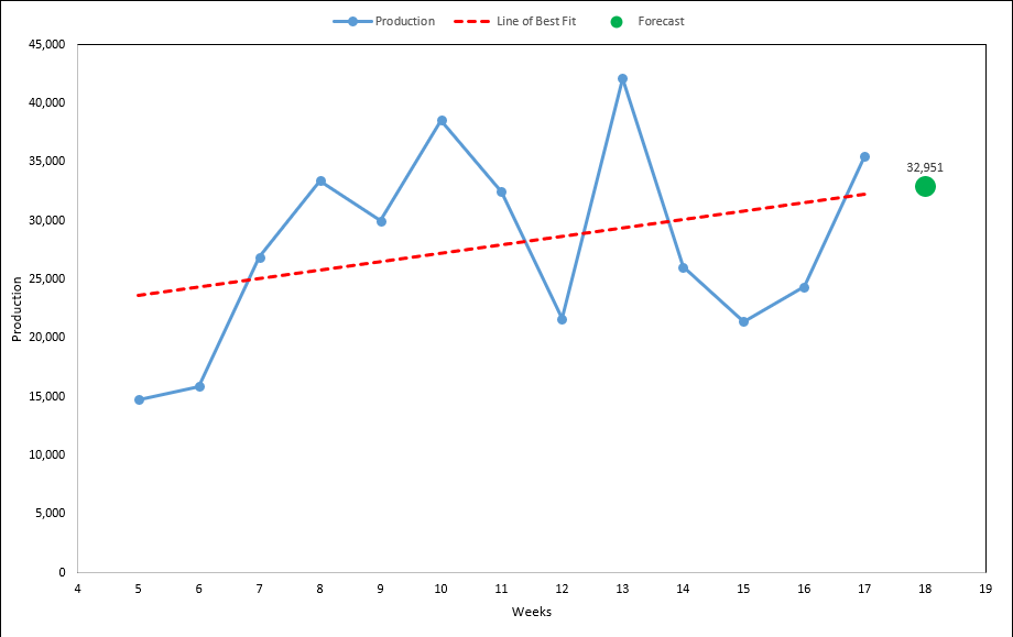
With Excel’s linear trend line function, we can create accurate and visual forecasts that model unknown future points. Perfect for short term forecasts that predict production, sales, demand, website traffic and much more!
Linear forecasting is very simple and easy to do - it’s always a great place to start. If you think you can roughly draw a line through your data, you could get decent results!
Steps
1. Create Sample Data and Graph
2. Create Trend Line
3. Forecast Future Point
4. Done
Create Sample Data and Graph
First steps are to type in sample data, and create the default graph with trend line. Follow along, or use your own data.
For data that has seasonality or cycles, I would recommend you start with no more than 5 data points for your model. A yet to be developed model will incorporate this, but for now the below tutorial works best for short term predictions.
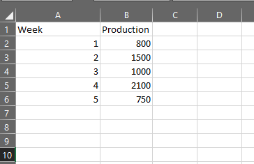
1. In cell A1 and B1, write “Week” and “Production” respectively
2. Add weeks to column A, use 1 through to 5 to follow along
3. Add production data to column B, 800, 1500, 1000, 2100, 1900
4. Select A1:B6
5. Click the “Insert” pane, and on “Recommended Charts”
6. Scroll to the bottom of list, and click on “Scatter”
7. You now have your basic graph and data!
Add Linear Trend Line to Graph
We now need to add a linear trendline to the graph. This will be the basis for our forecast model, you can tell by the graph that there is definitely a linear trend so we should get okay results!
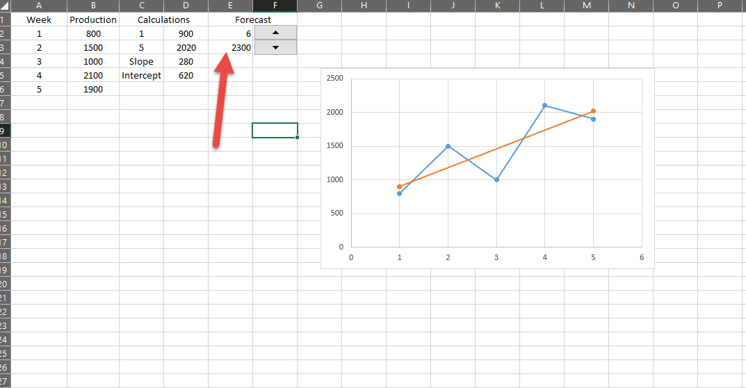
1. Cells C2:C5, write “1, 5, Slope, Intercept” respectively
2. In D4 write the formula “=SLOPE(B2:B6,A2:A6)”
3. In D5 write the formula “=INTERCEPT(B2:B6,A2:A6)”
Simply put slope is the steepness of the line, and the intercept is where the lines crosses the Y axis. Thanks to the above formula you don’t need to fully understand this to get your model to work - all this will do is draw a straight line through your data. You will get exactly the same result if you put Excel’s default trend line option on your graph.
With our slope and intercept numbers, we can now model our trend line and future forecasts!
4. In Cell D2, put “=C2*D4 + D5”. This is point on X Axis * Slope + Intercept
5. In Cell D3, put “=C3*D4 + D5”
1 and 5 should be 900 and 2020 respectively. This is the start and end of your trend line, of which we can now add to the graph.
6. Click on your graph
7. Click on the “Design” tab
8. Click on “Select Data”
9. Click on “Add”
10. In “Series name:”, write ="Trendline"
11. In “Series X values:”, click the select range button and select range C2:C3
12. In “Series Y values:”, click the select range button again and select D2:D3
13. Click OK twice
You now have a trend line, if you add the default Excel trend line to your graph, your custom one should look exactly the same. Now all we need to do is create and plot our forecasting model.
Adding Forecast to Graph
We now need to build our forecast model, to tell us what the production for week 6 will be.
1. Go to the developer pane
2. Click on “Insert”
3. Click on “Spin Button” and draw it roughly over F2:F3
4. Right click on the spin button, and “Format Control”
5. Set current value to 6
6. Set cell link to E2
7. Click OK
8. In E3, add the formula “=E2*D4 + D5”
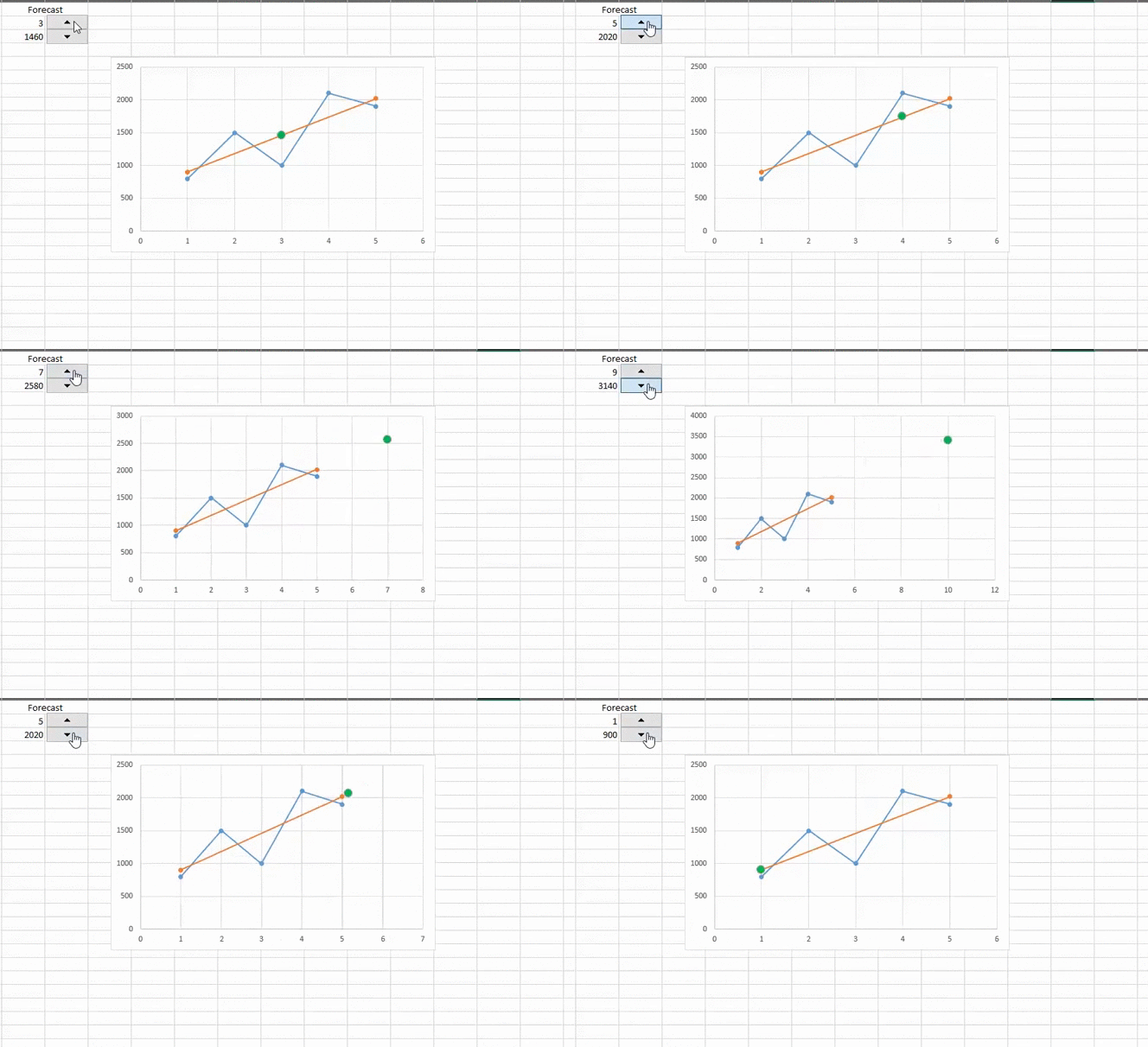
You can now click the button, and see the production number based on your linear model!
9. Click on your graph, go to the “Design Tab” and click on “Select Data” once again.
10. In “Series name:” write =”Forecast”
11. In X values, select E2
12. In Y values, select F3
13. Click OK twice
14. Right click on the point, and select “Format Data Point”
15. Navigate your way to the marker options, and play around until you get a decent icon
That’s it!
You now have a spreadsheets that forecasts and animates it on a graph!
After you clean it up and format, and you will have a great dashboard in no time! Or download my template below for a more refined version of the above tutorial. It includes all 5 different trendlines, Linear, Logarithmic, Power, Exponential and Polynomial!
Let me know how your linear forecasting works out, as I use this method to forecast end of week/month results, when we are halfway through the week/month. Helps generate a quantitative measure, and gets rid of the “my gut tell me x” decisions.
In the meantime, while not review previous production results with my KPI graph template. That way you can look ahead, and learn from past performances! Or why not get fancy, and email out daily forecasts automatically, using my Excel Email tutorial and Macro Schedule Tutorial!


